{ CSS Transforms. }
Objectives:
By the end of this chapter, you should be able to:
- Explain what the
transformproperty does - List some common methods that can be values of the
transformproperty - Use the
transformproperty to manipulate the layout on a page
CSS Transforms
Transforms are a newer CSS technology that allow us to move elements on the page by translating them, rotating them, scaling them, and more. Sometimes these transforms are used in isolation, but they're more commonly found in conjunction with CSS animations, which we'll get to in the next chapter.
There's only one property you need to know to use transforms: the transform property. However, this property can take a variety of different values. Here's an overview:
transform- CSS transforms change the shape and position of the affected content and allow you to translate, rotate, scale, and skew elements.A transformation is an effect that lets an element change shape, size and position. Here are a few of the methods that can be values of
transformproperty:translate- The translate() method moves an element from its current position. For example, if you give an element the ruletransform: translate(50px,100px);, the element will be 50 pixels to the right and 100 pixels down.rotate- The rotate() method rotates an element clockwise or counter-clockwise according to a given degree. For example, if you give an element the ruletransform: rotate(90deg);, the element will rotate 90° clockwise.scale- The scale() method increases or decreases the size of an element (according to the parameters given for the width and height). For example, if you give an element the ruletransform: scale(2,3);, the element will scaled 200% horizontally and 300% vertically.
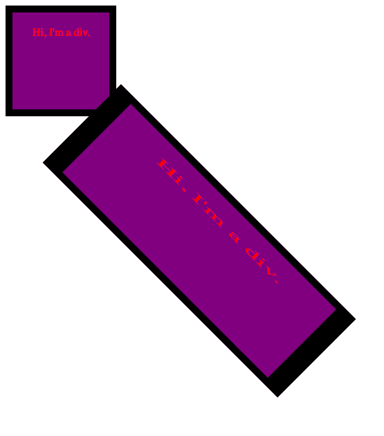
Here's an example of what these transforms look like in action. This HTML page has two divs with identical content, but one is transformed:
<!DOCTYPE html>
<html lang="en">
<head>
  <meta charset="UTF-8">
  <title>Document</title>
  <style>
    #original, #transformed {
      width: 100px;
      height: 100px;
      color: red;
      background-color: purple;
      text-align: center;
      padding: 20px;
      border: 10px solid black;
    }

    #transformed {
      transform: translate(200px, 100px) rotate(45deg) scale(3,1);
    }
  </style>
</head>
<body>
  <div id="original">Hi, I'm a div.</div>
  <div id="transformed">Hi, I'm a div.</div>
</body>
</html>

There are a number of other values that the transform property can take. For an exhaustive list, check out the documentation.
When you're ready, move on to CSS Transitions
