{ CSS Animations. }
Objectives:
By the end of this chapter, you should be able to:
- Explain what a keyframe is
- Use the
animationproperty along with@keyframesrules to create more complex CSS animations
Animations
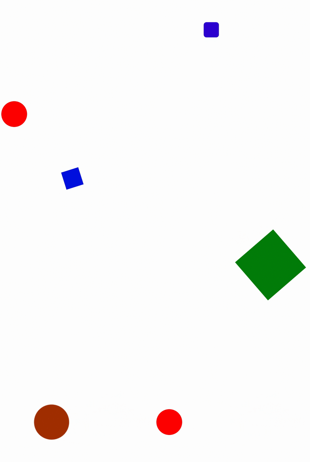
We've seen an example of how to perform a simple animation using CSS transitions. But what if we want to do something a little more complex? It turns out there's another CSS property called animation which we can use to define custom animations purely using CSS. CSS animations make it possible to create complex animation transitions from one CSS style configuration to another. To see how it works, let's walk through the process of creating the following animation:

To begin, let's create a simple html file and style a single div in it. This div will represent our shape:
<!DOCTYPE html>
<html lang="en">
<head>
  <meta charset="UTF-8">
  <title>Document</title>
  <style>
    #ball {
      width: 100px;
      height: 100px;
      margin-top: 400px;
    }
  </style>
</head>
<body>
  <div id="ball"></div>
</body>
</html>
To create our animation, we need two things: an animation property on the relevant HTML element, and a set of keyframes that describe the animation we're trying to build. Keyframes literally describe key frames in the animation, around which the animations take place. For example, there are three key points in the animation above: when our div is a red circle, when it's a blue square, and when it's a green (rotated) square.
When you're creating custom animations using keyframes, you need to give your animation a name before you build it. In this case, since our shape is changing, let's call our animation shapeshift. Our animation property might have a value that looks like this:
#ball {
    width: 100px;
    height: 100px;
    margin-top: 400px;
    animation: shapeshift 6s infinite;
}
The 6s indicates how long it should take to complete our animation, while the infinite ensures that the animation will play on loop, rather than stopping after one cycle. There are actually 8 sub-properties that you can set inside of animation; here's an article on all of them if you'd like to dig a little deeper.
If you view the page in Chrome, you'll see that nothing is working yet. That's because we haven't defined what shapeshift should do! In order to define this animation, we need to use the keyframes at-rule. Underneath your style for the ball div, add this:
@keyframes shapeshift {
    /* here's where we define our animation */
}
This is the basic syntax for defining custom animations using keyframes. Inside of the curly braces, we can define several different keyframes, which describe the state of our div at different points in the animation. These points are described using percentages. For example, we know that at the start and end of our animation, the ball div should be red and round. So we might set the following keyframes:
@keyframes shapeshift {
    0%, 100% {
        transform: translate(0,0);
        border-radius: 100px;
        background-color: red;
    }
}
If you reload the page now, you should see the red circle. So far, so good. But since the keyframes have the same style at the beginning and the end, there's not really any animation going on. We need to define some more keyframes to get the effect we're looking for.
For example, one-third of the way through the animation, we want the div to move to the right, move up, and be a smaller blue square. Here's how we might declare that keyframe:
@keyframes shapeshift {
    0%, 100% {
        transform: translate(0,0);
        border-radius: 100px;
        background-color: red;
    }

    33% {
        transform: translate(200px, -400px) scale(0.5, 0.5);
        border-radius: 0px;
        background-color: blue;
    }
}
Finally, two-thirds of the way through the animation, we want the square to spin, move down and to the right, grow larger, and turn green. Adding this rule completes our definition of the shapeshift animation:
@keyframes shapeshift {
    0%, 100% {
        transform: translate(0,0);
        border-radius: 100px;
        background-color: red;
    }

    33% {
        transform: translate(200px, -400px) scale(0.5, 0.5);
        border-radius: 0px;
        background-color: blue;
    }

    66% {
        transform: translate(400px, 0) rotate(4545deg) scale(2,2);
        border-radius: 0px;
        background-color: green;
    }
}
You should now have a working animation of a shape-shifting div!
You can learn more about CSS Animations here and see some more examples here and here. (Note: W3Schools is NOT a good resource for documentation in general, but they do have some helpful examples in this case.)
When you're ready, move on to Transforms, Transitions, and Animations Exercises
