{ React Design Patterns. }
Objectives
By the end of this chapter, you should be able to:
- Learn how to use styled components to componentize everything
- Understand how to structure React apps hierarchically with Atomic Design
Styled Components
As React developers, we can't get enough of components! In general, the more things that we can componentize (or at least modularize), the better.
A big issue with our React apps so far has been the styling. We have CSS floating around in external .css files that might be structured completely different from the components that use them.
An alternative to using external CSS modules (or even supplement -- you can do both) is a concept called styled components. Essentially, you bake in CSS styles to React elements to enhance them. We have HTML in our JavaScript via JSX, so why not add some CSS to our JavaScript!?
There are several packages to achieve this:
- styled-components - the original styled components library and most widely-used.
- glamorous - by Paypal / Kent C. Dodds, also popular, inspired by styled-components, but with a different API.
- emotion - gaining popularity, inspired by the above two libraries, slightly different API again.
Each of the above libraries is perfectly valid; they all have their own interpretation of the same CSS-in-JavaScript approach but with different syntax / methods. We are going to use styled-components for this section.
Let's jump into an example and then we can explain what is going on.
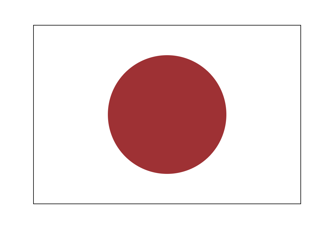
Styled Components Example: Flag of Japan
In an applied example, we can make a simple design using styled components.
Let's use create-react-app to boilerplate a basic project for us:
create-react-app flag
cd flag
npm i styled-components
npm start
New file: Rectangle.js
import styled from 'styled-components';

/*
  making components by referencing the styled wrappers for them.
   styled.div is a function that wraps around a React div element.
   The CSS is done in a string in normal kebab-case!
*/
const Rectangle = styled.div`
  height: 300px;
  width: 450px;
  margin: 100px auto;
  border: 1px solid black;
`;

export default Rectangle; // exported like a normal component
New file: Circle.js
import styled from 'styled-components';

/*
  This variable can easily be interpolated to a styled component
  because they are defined using template strings
 */
const red = '#ad232f';

const Circle = styled.div`
  border-radius: 50%;
  height: 200px;
  width: 200px;
  background-color: ${red};
  margin: 50px auto;
`;

export default Circle;
Now for App.js:
import React from 'react';
import Rectangle from './Rectangle';
import Circle from './Circle';

const App = () => {
  /*
    Our styled components are immediately usable in JSX
     just like our other components since they are simply functions
     that wrap React elements.
   */
  return (
    <Rectangle>
      <Circle />
    </Rectangle>
  );
};

export default App;
The result should look something like this:

Styled Components use Template Strings
The syntax for styled components is an addition to JavaScript that came with ES6: tagged template strings.
You can see the slightly unusual syntax of the element (which is actually a function) followed immediately by backticks, e.g.
element`
  color: blue;
  ${/* a javascript comment has to be interpolated */}
`;
This is kind of a hybrid between a string and a function. From MDN:
If there is an expression preceding the template literal (tag here), this is called a "tagged template". In that case, the tag expression (usually a function) gets called with the processed template literal, which you can then manipulate before outputting.
While we can utilize this syntax as part of the styled-components package's API without getting too deep into tagged templates, if you are curious how it all works you can read more on MDN here or check out this helpful article by Wes Bos.
Styled Components with Props
The great thing about styled components is that they can also accept props.
Let's make another example using some props! We'll do a picture component called Pic that will either show up as a square or circle of custom size, depending on the props.
Pic.js
import React from 'react';
import PropTypes from 'prop-types';
import styled from 'styled-components';

/*
  Box is going to be a styled component designed to wrap an image/
   * The radius is 50% if the 'round' prop is passed (it acts like
     a boolean flag here).
   * Since we want the image to be a square or circle, the height
     and width are set to the same prop, 'size', which is a number.
 */
const Box = styled.div`
  border-radius: ${props => (props.round ? '50%' : '0%')};
  width: ${props => props.size}px;
  height: ${props => props.size}px;
  overflow: hidden;
  margin: 50px;
`;

/*
  Box can and should have prop types and default props just
   like your other normal React components!
*/
Box.propTypes = {
  size: PropTypes.number,
  round: PropTypes.bool
};

Box.defaultProps = {
  size: 200,
  round: false
};

/*
 Pic is a composite of our box (styled div), wrapping an image.
  Notice it passes its 'size' and 'round' props directly through
  to the styled component 'Box', while the imgSrc gets passed to
  the img element.
*/
const Pic = props => {
  return (
    <Box size={props.size} round={props.round}>
      <img src={props.imgSrc} />
    </Box>
  );
};

Pic.propTypes = {
  imgSrc: PropTypes.string,
  size: PropTypes.number,
  round: PropTypes.bool
};

Pic.defaultProps = {
  imgSrc: 'https://www.infschool.com/assets/team/whiskey.jpg'
};

export default Pic;
Inside App.js let's make two different versions using props:
import React from 'react';
import Pic from './Pic';

const App = () => {
  return (
    <div>
      <Pic size={300} />
      <Pic round />
    </div>
  );
};

export default App;
The result should look something like this:

Atomic Design
Atomic Design is one of the most popular web design patterns when working with component-based architecture. It's a great fit for organizing React applications!
The Problem
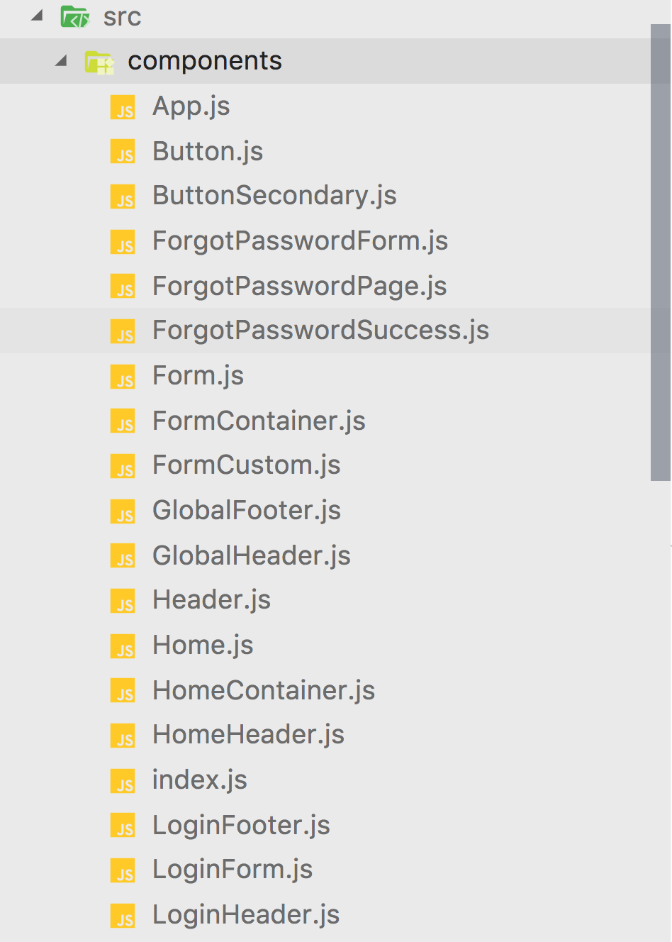
When you start moving beyond toy / demo React apps, component organization can become a huge issue. Basically, it doesn't scale very well to have an application with 100+ components that are all just siblings in the same directory:

The above image is just a made-up example; real apps might be a lot worse!
React projects without a predictable structure can be inefficient. Developers constantly have to search for the correct component code, and it does very little to foster a mental model of component hierarchy. Is HomeHeader a child of GlobalHeader or are they siblings where you use one of the other? What is the relationship between LoginForm and Form and FormContainer?
While some of this can be chalked up to just naming things better, remember that developers often have trouble naming things, because it's hard!
Luckily, while naming things is hard, categorizing things based on their relationship is much easier and will help us a lot.
Atomic Design Principles
Atomic Design uses some intuitive science-inspired categories to group things into a hierarchy. Here is the hierarchy:
- atoms - tiniest UI elements on a page, e.g. a
buttonor aninput. - molecules - basic functionality of a few atoms combined together, e.g. a nav bar consists of several buttons.
- organisms - a functioning module of molecules and atoms, e.g. a full header would have navigation and a search bar.
- templates - a way of laying out organisms, molecules, and atoms on a page, e.g. a blog website might have a "base" template and a "blog" template.
- page - an specific instance of a template, e.g. the home page is an implemented base template.

If you want to learn more from the originator of this idea, check out Brad Frost's website on atomic design! And maybe his book too.
Example: Componentizing GitHub
What it looks like normally
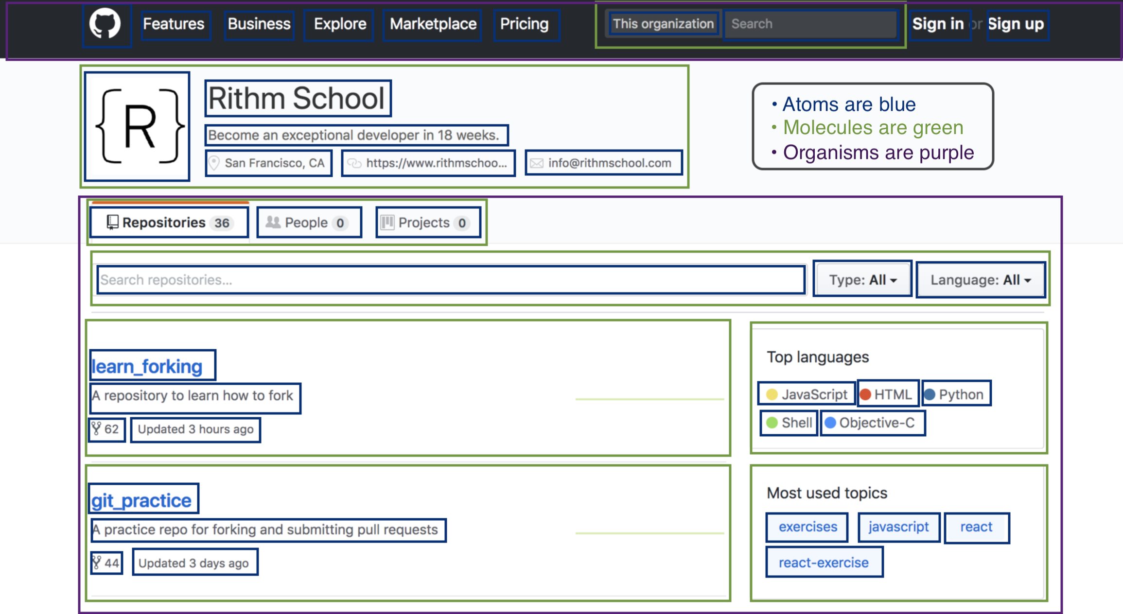
Here is a screenshot of Inf-Paces School's GitHub:

Annotated
Here is a possible grouping of visual elements into atomic design components:

In the above example:
- page: the entire view, a single component that lays out two organisms
- organisms: the header and the repositories module
- molecules: Inf-Paces School header, repositories tabs, search bar, repository cards, top languages card, most used topics card, etc.
- atoms: heading + sub-heading text, nav items, images, breadcrumbs, icons.
The exact classification of items is subjective, so this is just one possible interpreation of many. The point is that you agree with your designer / team about where to draw the lines between components, and that there is some show of logical hierarchy.
Application to React
Let's apply atomic design to React:
- atoms - styled components or simple wrappers around JSX elements. These should be "dumb components", i.e. purely visual with props and no state. Examples: a styled
button, a styledinputbox, a card (styleddiv),etc. - molecules - components that import several atoms to create slightly more complicated, but still "dumb" components. Examples: a navbar, a user card, etc.
- organisms - components that import atoms or molecules. This is generally where we can start to think of "smart" components, or components with state. It's easy to remember because organisms have brains! Examples: a form component, a filterable list, etc.
Templates and pages are typically dumb components as well, just used as a layout for stateful components. However, because of downward data flow principles, you may want to make an API request on a page and pass it down to multiple organisms, etc.
Arc
We highly recommend checking out ARc (Atomic React), particularly the example source files, for inspiration on how to model your React apps in practice. There is even a branch for Redux (which we'll cover after the next section.)
Additional Resources
When you're ready, move on to Testing with Jest
